The Icon Is Part of the Interface
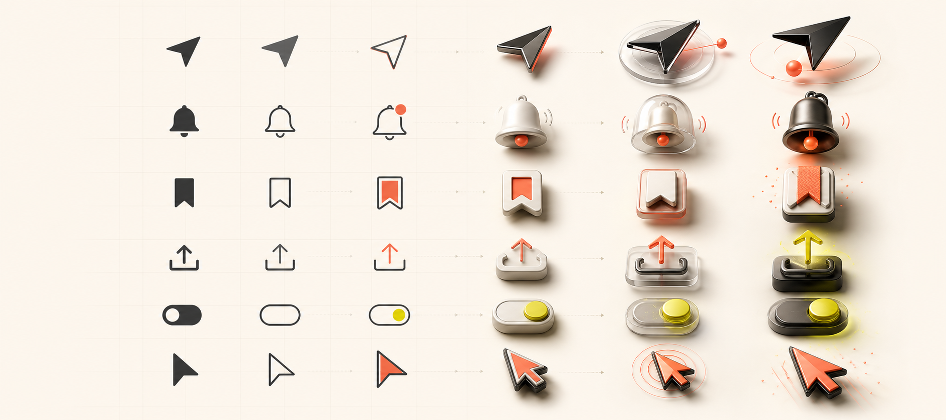 A familiar symbol can stay recognizable while gaining motion, material, and a point of view.
Most interfaces do not need more icons. They need icons that do more than occupy a square.
The usual workflow is understandable: search a library, pick the closest bell, bookmark, or arrow, and move on. Stock icon sets are consistent, legible, and fast. They are also used by thousands of products. When every interface reaches for the same outline bell, the same heart, and the same paper-plane arrow, a small opportunity disappears—the opportunity to make an interaction feel native to the product.
Custom icon design is not about drawing a fancy replacement for every familiar symbol. It is about deciding where an icon can carry meaning, state, and personality at the same time.
An icon has three jobs
The first job is recognition. A person should not need to decode a new visual language just to save a page or open a menu. Familiar silhouettes are useful because people already know them.
The second job is state. A bookmark should look saved after it is pressed. A notification icon should distinguish quiet from unread. A send icon should acknowledge that the message has actually left. Color can help, but shape and motion can communicate the change more clearly.
The third job is tone. Geometry has a voice. Rounded corners can feel soft; sharp cuts can feel technical; uneven strokes can feel handmade. The icon is one of the smallest places where a product's character can show up repeatedly.
Stock icons usually solve recognition well. The interesting design work begins with the other two jobs.
From a glyph to a behavior
I find it more useful to design an icon as a tiny state machine than as a static drawing:
rest → hover → press → selected → confirmation
Each transition should answer a question. Did the interface notice me? Did the action happen? What changed?
Consider three ordinary actions:
- A bell can lean toward the cursor, compress on press, and release with one restrained ring.
- A bookmark can pull its inner ribbon down before filling, making "saved" feel like a place the object arrived at rather than a color swap.
- A send arrow can tighten, move forward a few pixels, and leave a short trail that disappears once the action is complete.
None of these needs a long animation. Around 180–300 milliseconds is often enough. The motion is feedback, not a performance.
What makes a custom icon worth keeping
A custom icon earns its place when it is clearer or more expressive without becoming harder to use. I use a few constraints to keep that balance.
Keep the silhouette familiar
The outer shape should still read at a glance. Personality can live in the internal cut, the stroke ending, the fill behavior, or the transition. If the basic meaning becomes a puzzle, the design has gone too far.
Build a grammar, not a collection
One clever icon beside fifteen generic ones feels accidental. A system needs shared decisions: the same stroke weight, corner logic, optical size, motion curve, and active-state treatment. Those rules create a family even when the symbols are different.
Let motion explain the state
The best animation shows cause and effect. Rotation works for refresh because the action is cyclical. A check can draw itself because completion is progressive. Random bouncing may attract attention, but it rarely adds meaning.
Design at the real size
An icon that looks beautiful on a 600-pixel artboard can collapse at 20 pixels. I test the final stroke, spacing, and movement inside the actual button, beside the actual label, on both light and dark surfaces.
A practical build process
I start with verbs rather than pictures: save, reveal, dismiss, connect, upload. Then I sketch the resting and completed states before filling in the transition between them.
For implementation, SVG is usually the right material. It stays sharp, accepts CSS variables, and lets individual parts move independently. Most interactions only need transforms, opacity, stroke-dash animation, or a small path change. That keeps the behavior lightweight and makes it easy to share timing and easing tokens across a design system.
The final checklist is less glamorous but more important:
- Does the icon remain understandable with motion turned off?
- Does it work with
prefers-reduced-motion? - Does the control have an accessible name that describes the action?
- Is selected state communicated by more than color alone?
- Does the animation stay smooth on an ordinary phone?
An icon-only button still needs an aria-label, a comfortable hit area, keyboard focus, and a
clear selected state. Custom visuals never replace those fundamentals.
The goal is not novelty
I do not want every upload arrow to become a miniature art project. Repetition is one of the things that makes an interface learnable. Most utility icons can remain quiet.
But a few high-frequency or identity-defining actions deserve more care. Those are the moments where a custom icon can turn a generic control into something people recognize as belonging to one product.
The difference is small on a screen. Across hundreds of interactions, it becomes the texture of the whole experience.